Selection of colors is complex and subjective. I’ll offer here a broad and somewhat concise starting point.
Here, I am talking about color selection and more specifically, raw dry pigments. Much of the advice here also relates to prepared tubed paint. I would perhaps add that the light fluffy powders of synthetic organic pigments (Quinacridone, Hansa, Phthalocyanine, etc.) are generally too difficult to handle in the average painter’s studio. Their tinting strength is so high as to overpower other colors on the palette, unless they’re cut with a filler such as chalk or blanc fixe – PW21.
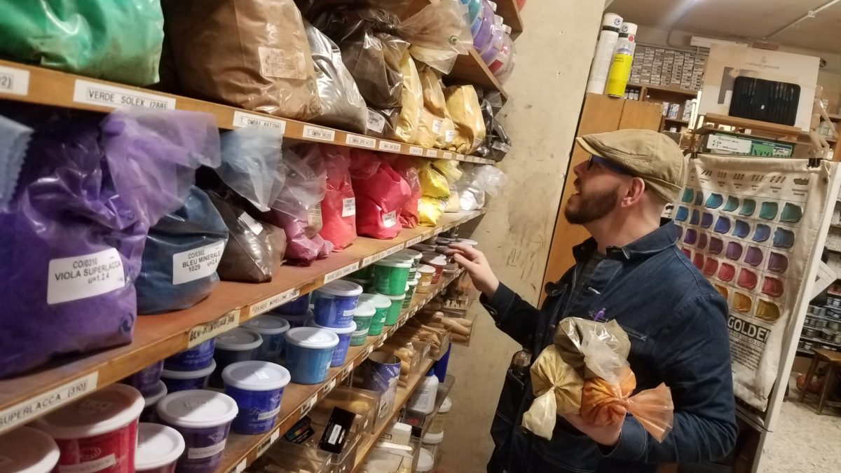
Regarding pigments. There are a few sources for those, depending on color. Of course, Kremer, Natural Pigments, along with Jerry’s Artarama and Blick who’ll have a smaller selection. Ceramic supply companies will have several earth colors, titanium dioxide, and chromium oxide green, and they’ll be cheaper than the same colors from the other sources. For example, a pound of iron oxide red is five bucks from Mid-South Ceramics versus five times that cost from Blick.
So on to pigment selection. (click to skip to summary) The earth colors are by far the greatest bang for the buck. It’s dirt. Well, it’s iron oxide, which is dirt without any organic material like decaying leaves and bugs and such. Cave painters used earths, Rembrandt used them, we use them.
Iron Oxide reds come in a range from bluish Indian Red through more orange English Red. Synthetic iron oxides are often called Mars colors. Any and all are useful. You can also forage for ochres.
Red and Yellow
Similarly, Iron Oxide Yellows, or hydrated iron oxide, come in a range from the lemony Limonite to the more orangey ochres and raw sienna. There are also synthetic Mars Yellows.
For higher saturation reds and yellows, Cadmiums are the usual choice. They are pricey and some would say toxic. There’s not much research to back up their modern versions being of any concern though. Gone are the days of free unbound cadmium just roaming around in your paint. Manufacturers have refined their process and what cadmium is there, is bound up with Sulfur and Selenium and not “biologically available”. If for some reason, cost perhaps, you may want a substitute, there are Nickel Titanate yellows that are opaque and lemony, Chrome Antimony Titanate that’s warmer and somewhere between a Cadmium Yellow Medium and a Yellow Ochre. As for substitutes for Cadmium Red, there are Pyrrol Reds, which come in a similar range but somewhat more transparent.
There’s also a range of Green Earths or Terre Verte, they come in a blue-green to yellow-green. They have low tinting strength but are wonderfully delicate.
Green
Chromium Oxide green is a useful opaque sort of army green. For a bluer and more transparent green, there’s Viridian.
Blue
For blues, there’s Ultramarine (or French Ultramarine, as opposed to Lapis Lazuli). This pigment alone comes in a range from greenish to reddish, depending on temperature of manufacture. Similar to earth colors which often come in raw or burnt versions. All the colors mentioned so far are pretty inexpensive. Cerulean Blue and Cobalt blue are a couple nice ones that are pricier, both containing Cobalt. Prussian Blue is a favorite too, for its strength and subtlety.
Purple
My favorite purple is Manganese Violet. It’s every bit as nice as Cobalt violet but cheaper.
We’re coming around the color wheel, so a crimson is called for. The usual Alizarin Crimson is not lightfast so I can’t recommend it. Up until now, the colors I’ve suggested are all mineral based. In olden times, artists would use dried plant material, or even bugs like in the case of cochineal, for reds. We now have a huge range of synthetic organic reds and roses without going to war with any roses. Quinacridone and Perylene are good choices here. They’re both transparent and very lightweight powders with high tinting strength, so be warned about that. A little goes a very long way.
For the achromatic pigments, there are just a few. Chalk (Calcium Carbonate, either in natural marble dust or precipitated) is a nice low tinting strength white with many uses from grounds to fillers or extenders for other pigments. I like the precipitated calcium carbonate because of its small particle size and easy mixability.
White
Titanium White is a strong, very bright white that I often cut with chalk.
Black
The commonly used Ivory Black or Lamp Black, both carbon blacks, can be useful but don’t easily mix with tempera. Unless the very blackest black is required, an iron oxide black can be a more manageable pigment. Mars Black or Black Roman Earth are common names.
I believe that rounds out the range. I’ll summarize, with Color Index names. CI names allow us to know what pigment we’re looking for, no matter the name. For example, PR101 could go by at least a dozen names but they’re all iron oxide reds. The Color Index Number does not specify much about the actual color though. PR101 could be a huge range of reds, depending on the temperature it’s produced at or the other elements present, in addition to iron oxide.
- English Red – PR101
- Yellow Ochre – PY42
- Raw Umber – PBr7
- Nickel (lemony PY53 or warmer PBr24) or Cadmium based Yellow – PY35
- Cadmium Red – PR108 or Pyrrol – PR254
- Chromium Oxide Green – PG17
- Green Earth or Terre Verte – PG23
- French Ultramarine Blue – PB29 – I’d opt for the reddish variant if there’s an option
- Cerulean Blue – PB35
- Prussian too if you just can’t help yourself. Who could? – PB27
- Manganese Violet – PV16
- Quinacridone Rose – PV19 or PR122
- Titanium White – PW6
- Black Roman Earth – PBk11
- Chalk – PW18
All these pigments are compatible with oil, watercolor, acrylic, tempera, casein, and most anything else. Only ultramarine is incompatible with the alkaline fresco.
If painting in oil, I’d suggest adding the following:
- Lead White – PW1 – do not handle in powder form unless you have proper PPE. Often called Cremnitz White, this pigment is low tinting strength, slightly warmer, and in oil, has a brush feel that is unmatched by any other white.
- Ivory Black – PBk9 – this color doesn’t readily combine with aqueous media. It’s a slow drier in oil.